Home>Arts and Culture>How To Make Gray
Arts and Culture
How To Make Gray
Published: February 28, 2024
Learn the art of creating the perfect shade of gray with our comprehensive guide. Explore the cultural significance and techniques in arts and culture. Unlock the secrets of gray-making today!
(Many of the links in this article redirect to a specific reviewed product. Your purchase of these products through affiliate links helps to generate commission for Regretless.com, at no extra cost. Learn more)
Table of Contents
Introduction
Gray is a versatile and sophisticated color that holds a unique place in the world of art and design. Its understated elegance and ability to complement a wide range of hues make it a popular choice for artists, interior decorators, and fashion designers alike. Whether you're a budding artist or a DIY enthusiast looking to add a touch of modernity to your living space, mastering the art of creating the perfect shade of gray is a valuable skill.
In this comprehensive guide, we will delve into the intricacies of mixing and manipulating colors to achieve various tones and shades of gray. From understanding the properties of the color gray to exploring different methods of creating it, this article will equip you with the knowledge and techniques needed to produce stunning gray hues with confidence.
Join us on this creative journey as we unravel the secrets of crafting the perfect gray, whether it's for a painting, a home decor project, or a fashion statement. By the end of this guide, you'll be well-versed in the art of mixing and adjusting colors to achieve the ideal shade of gray for your artistic or design endeavors. So, let's embark on this colorful adventure and unlock the endless possibilities that the color gray has to offer.
Read more: How To Make A Ring
Understanding the Color Gray
Gray, often considered a neutral color, is a complex and intriguing hue that holds a special place in the world of art and design. It is a unique amalgamation of black and white, embodying a sense of balance, sophistication, and versatility. Understanding the properties of gray is essential for artists, designers, and anyone seeking to incorporate this timeless shade into their creative endeavors.
In the realm of color theory, gray is often described as achromatic, meaning it lacks any dominant wavelength of light. This characteristic gives gray its neutral appearance, allowing it to seamlessly complement a wide spectrum of colors. From soft, dove gray to deep, charcoal hues, the versatility of gray makes it a valuable asset in the creative palette.
Gray is not simply a single shade; rather, it encompasses a broad range of tones and undertones. Cool grays tend to have blue or green undertones, evoking a sense of calm and tranquility, while warm grays may contain hints of red or yellow, exuding a cozy and inviting feel. Understanding these subtle variations is crucial for achieving the desired mood and aesthetic in artistic and design endeavors.
In the natural world, gray is abundant, appearing in the form of stormy skies, weathered stones, and sleek metals. Its prevalence in both organic and industrial settings makes it a relatable and familiar color, evoking a sense of timelessness and resilience.
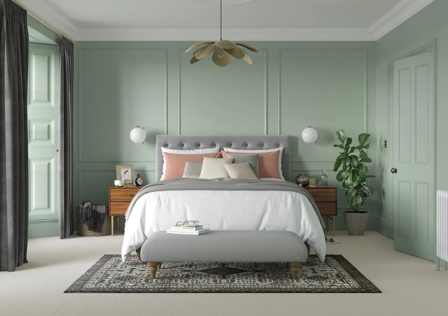
Furthermore, the psychological impact of gray should not be overlooked. It is often associated with attributes such as stability, intelligence, and sophistication. In interior design, gray is frequently used to create a sense of balance and harmony, whether as a dominant color or as a complementary backdrop for bolder hues.
By comprehending the nuances of the color gray, individuals can harness its inherent qualities to evoke specific emotions, establish visual harmony, and elevate the overall impact of their creative endeavors. Whether used as a standalone color or in conjunction with other hues, gray's understated elegance and adaptability make it an invaluable asset in the realm of art and design.
Mixing Gray with Primary Colors
Mixing gray with primary colors is a fundamental aspect of color theory and an essential skill for artists and designers. By understanding the principles of color mixing, individuals can create a diverse range of gray shades to suit their creative needs. When it comes to mixing gray, the primary colors—red, blue, and yellow—play a pivotal role in achieving the desired tones and undertones.
Red, Blue, and Yellow: The Building Blocks of Gray
To create a basic gray hue, artists often rely on a combination of primary colors. By blending equal parts of red, blue, and yellow, a muted, neutral gray can be achieved. This method leverages the subtractive color mixing model, where the primary colors absorb certain wavelengths of light, resulting in the perception of gray. Experimenting with different ratios of these primary colors allows for the customization of gray shades, from cool, bluish grays to warmer, earthy tones.
Understanding Color Relationships
The process of mixing gray with primary colors also involves an exploration of color relationships. For instance, incorporating more red into the mixture tends to produce warmer gray tones, while an emphasis on blue may yield cooler, bluish grays. By manipulating the proportions of primary colors, artists can fine-tune the resulting gray shades to align with their artistic vision and the intended mood of their work.
Read more: How To Make A Money Bouquet
Achieving Depth and Dimension
Furthermore, the interaction between primary colors and their complementary hues can influence the depth and dimension of the resulting gray. For instance, mixing a warm red with a cool blue can produce a nuanced, balanced gray with subtle undertones. This interplay of colors adds complexity and richness to the gray palette, allowing for the creation of visually captivating and harmonious compositions.
Creative Exploration and Experimentation
Ultimately, mixing gray with primary colors is a process that invites creative exploration and experimentation. Artists and designers are encouraged to embrace the inherent variability of color mixing, allowing for the discovery of unique gray shades that resonate with their artistic sensibilities. By mastering the art of blending primary colors to create gray, individuals can expand their creative repertoire and infuse their works with depth, balance, and visual intrigue.
In summary, the process of mixing gray with primary colors is a dynamic and rewarding endeavor that empowers individuals to harness the full spectrum of color possibilities. By leveraging the foundational principles of color theory and embracing the inherent versatility of primary colors, artists and designers can craft an array of captivating gray hues that elevate their artistic expressions and design concepts.
Using Complementary Colors to Create Gray
In the realm of color theory, the concept of using complementary colors to create gray opens up a world of artistic exploration and visual harmony. Complementary colors, positioned opposite each other on the color wheel, possess the unique ability to neutralize and balance each other when combined. This intriguing phenomenon forms the basis for leveraging complementary colors to achieve various shades of gray with distinct undertones and vibrancy.
The interplay of complementary colors, such as red and green, blue and orange, or yellow and purple, offers a compelling approach to crafting nuanced gray hues. By blending these opposing hues in precise proportions, artists and designers can unlock a spectrum of captivating grays that exhibit subtle hints of their underlying complementary colors. This method not only yields visually engaging results but also allows for the creation of harmonious color palettes that resonate with depth and sophistication.
When utilizing complementary colors to create gray, the proportions and intensity of the chosen hues play a crucial role in determining the character of the resulting gray. For instance, mixing a vibrant, warm red with a rich, cool green can produce a balanced, mid-tone gray with a touch of warmth, while adjusting the ratio of the complementary colors can lead to variations in the resulting gray's undertones and visual impact.
Furthermore, the process of using complementary colors to create gray encourages artists and designers to consider the interplay of light and shadow within their compositions. The dynamic fusion of opposing hues to form gray opens up opportunities for exploring the subtle shifts in color temperature and luminosity, adding depth and dimension to artistic works and design concepts.
By embracing the concept of complementary colors as a pathway to gray, individuals can infuse their creative endeavors with a sense of equilibrium and visual intrigue. Whether seeking to evoke a serene, balanced atmosphere or to introduce captivating contrasts within their compositions, the utilization of complementary colors to create gray offers a rich and versatile approach to color manipulation.
In summary, the utilization of complementary colors to create gray represents a captivating fusion of color theory and artistic expression. By harnessing the inherent relationships between complementary hues and their ability to converge into harmonious grays, artists and designers can expand their creative palettes and imbue their works with a captivating interplay of colors and emotions.
Adjusting the Tone and Shade of Gray
Adjusting the tone and shade of gray is a nuanced and intricate process that allows artists and designers to fine-tune the visual impact and emotional resonance of their creations. By manipulating the undertones, brightness, and saturation of gray, individuals can achieve a diverse spectrum of hues, each possessing its own unique character and aesthetic allure.
One of the primary methods for adjusting the tone and shade of gray involves the incorporation of white and black to create tints and shades, respectively. By gradually introducing white into gray, artists can produce an array of soft, ethereal tones that exude a sense of lightness and purity. These lighter tints of gray are often utilized to evoke a serene and airy ambiance, making them ideal for creating tranquil landscapes, delicate still-life compositions, and ethereal portraiture.
Conversely, the addition of black to gray yields deeper, more dramatic shades that convey a sense of depth and intensity. These darker shades of gray are prized for their ability to imbue artworks and design elements with a touch of mystery and gravitas. Whether used to render dramatic shadows in a painting or to add a sense of sophistication to interior decor, the manipulation of gray shades through the infusion of black opens up a realm of artistic possibilities.
Furthermore, adjusting the undertones of gray by introducing subtle hints of complementary colors or analogous hues can impart a distinct mood and character to the resulting shades. For instance, infusing a cool gray with a touch of blue can evoke a sense of tranquility and introspection, while incorporating warm undertones can infuse gray with a cozy and inviting feel. This deliberate manipulation of undertones allows artists and designers to tailor the emotional resonance of their creations, ensuring that the chosen shades of gray harmonize seamlessly with the intended aesthetic and narrative.
In the realm of digital art and design, the precise adjustment of gray tones and shades through software tools enables creators to achieve unparalleled control over the visual impact of their works. By leveraging digital color manipulation techniques, artists and designers can fine-tune the tonal balance, luminosity, and color temperature of gray, resulting in compositions that exude precision and sophistication.
In summary, the art of adjusting the tone and shade of gray is a captivating journey that empowers individuals to imbue their creations with depth, emotion, and visual allure. Whether through traditional color mixing techniques or digital manipulation, the ability to finely tune the nuances of gray opens up a world of creative possibilities, enriching artistic expressions and design concepts with a captivating interplay of tones and shades.
Read more: How To Make Beige Color
Tips for Achieving the Perfect Gray
-
Start with Quality Pigments: When embarking on the journey to create the perfect gray, begin with high-quality pigments. Whether working with paints, dyes, or digital color palettes, investing in superior pigments forms the foundation for achieving rich, nuanced gray hues with exceptional depth and vibrancy.
-
Embrace Gradual Mixing: Patience is key when mixing gray. Start with small increments of color and gradually blend them together, allowing the hues to meld and harmonize. This gradual approach enables precise control over the resulting gray, ensuring that the desired tone and undertones are achieved with finesse.
-
Explore Color Ratios: Experiment with different ratios of primary colors or complementary hues to discover a diverse range of gray shades. By varying the proportions of colors, artists and designers can unlock a spectrum of grays, each possessing its own unique character and visual impact.
-
Observe Lighting Conditions: Consider the lighting conditions under which the gray will be viewed. Natural and artificial lighting can influence the perceived warmth or coolness of gray, prompting adjustments to the undertones and shades to ensure optimal visual harmony in various environments.
-
Utilize Color Mixing Guides: Reference color mixing guides and resources to gain insights into the intricate relationships between primary colors and their resulting grays. These guides provide valuable knowledge on color theory and serve as a roadmap for achieving specific gray tones with precision.
-
Layer and Blend: In the realm of painting and digital art, layering and blending techniques can elevate the complexity and luminosity of gray. By layering translucent washes or employing digital blending tools, artists can imbue their grays with a captivating sense of depth and dimension.
-
Consider Context and Mood: Tailor the choice of gray to the context and mood of the artistic or design project. Whether aiming for a serene, ethereal gray for a landscape painting or a bold, dramatic gray for interior decor, aligning the gray with the intended narrative and ambiance is essential.
-
Seek Inspiration from Nature: Draw inspiration from the natural world, where gray abounds in diverse forms. Observing the subtle variations of gray in natural elements such as stones, clouds, and foliage can inspire the creation of authentic and evocative gray hues in artistic endeavors.
-
Document and Refine: Keep a record of successful gray mixtures and adjustments, allowing for continuous refinement and improvement. This iterative approach fosters a deeper understanding of color manipulation and facilitates the development of a personalized palette of perfect grays.
-
Trust Intuition and Experimentation: Ultimately, trust your intuition and embrace experimentation. The process of achieving the perfect gray is a creative exploration that invites spontaneity and discovery. By allowing room for experimentation, artists and designers can uncover unexpected and captivating gray hues that resonate with their artistic vision.
Incorporating these tips into the creative process empowers individuals to master the art of achieving the perfect gray, unlocking a world of artistic possibilities and design excellence.
Conclusion
In conclusion, the art of creating the perfect shade of gray is a captivating journey that intertwines color theory, artistic expression, and design sensibilities. Gray, with its timeless elegance and versatile nature, holds a unique allure that resonates across various creative domains. From the subtle interplay of primary colors to the harmonious fusion of complementary hues, the process of crafting gray embodies a delicate balance of precision and artistic intuition.
Throughout this exploration, we have delved into the multifaceted nature of gray, unraveling its nuanced properties, psychological impact, and diverse applications in art and design. By understanding the intricacies of gray as a neutral, achromatic color, individuals gain insight into its potential to evoke emotions, establish visual harmony, and serve as a foundational element in creative compositions.
The journey of mixing gray with primary colors and utilizing complementary hues has illuminated the boundless possibilities for achieving captivating shades of gray, each imbued with its own character and aesthetic allure. Whether seeking to evoke tranquility with cool, bluish grays or infuse warmth with earthy, reddish tones, the art of crafting gray empowers creators to tailor their palettes to suit their artistic visions and design narratives.
Furthermore, the deliberate manipulation of gray tones and shades, whether through the infusion of white and black or the introduction of subtle undertones, offers a pathway to infusing depth, dimension, and emotional resonance into artistic works and design concepts. This meticulous process enables individuals to fine-tune the visual impact of gray, ensuring that each shade harmonizes seamlessly with its intended context and mood.
As we conclude this colorful journey, it is evident that the art of creating the perfect gray transcends technical proficiency; it is a testament to the fusion of creativity, intuition, and a deep appreciation for the nuances of color. Whether in the realm of painting, interior design, fashion, or digital art, the mastery of gray empowers individuals to imbue their creations with sophistication, balance, and timeless allure.
Ultimately, the pursuit of the perfect gray is a celebration of artistic expression and the boundless potential of color. By embracing the intricacies of gray and honing the skills to manipulate it with finesse, individuals embark on a vibrant and enriching creative odyssey, where each shade of gray becomes a testament to their artistic vision and mastery of the colorful tapestry that defines our world.